

Texas Woman's Univeristy
Denton, TX
How distinct branding approaches created cohesive experiences across two campus buildings.
Texas Woman’s University (TWU) is a multi-campus institution with an evolving built environment that calls for long-term planning, clarity, and consistency. Takeform’s collaboration with TWU began in 2017 with interior signage for the renovation of Jones Hall on the Denton campus and has since developed into an ongoing partnership.
Through continued work and close coordination with TWU facilities management and local representative KSM Design Source, Takeform established a practical understanding of the university’s standards, processes, and spatial conditions. That continuity has supported implementation across more than 30 buildings on the Denton campus, as well as projects in Houston and Dallas – helping maintain coherence across varied contexts and scales.
LOCATION:
Denton, TX
OTHER CONTRIBUTORS:
PRODUCTS

The Moment to Tell a Bigger Story
In 2023, TWU undertook two projects that marked a shift toward fully integrated, large-scale branding: the Welcome Center at Brackenridge Hall and the new Health Sciences Center. While each building serves a distinct role, both required graphic systems that could support architecture, clarify experience, and reflect the university’s identity. In collaboration with architecture firms PBK and SmithGroup, environmental graphic systems were developed to respond to each building’s audience, material language, and place within the campus.
Brackenridge Hall – Welcome Center
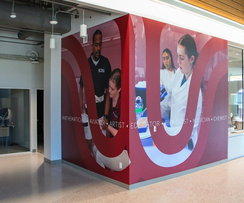
Brackenridge Hall presented an opportunity for Texas Woman’s University to reframe first impressions. Formerly a student union and cafeteria, the building was transformed into the university’s Welcome Center and a hub for student-facing services. Situated at the heart of the Denton campus, it serves as the starting point for campus tours and a primary point of orientation for prospective students, families, and community members – positioning the space as TWU’s most visible expression of its brand.
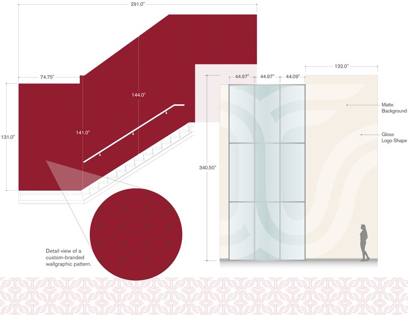
The graphic approach focused on narrative and experience. The university envisioned Brackenridge Hall as a vibrant, real-world introduction to campus life – one that could communicate academic breadth, diversity, and a strong sense of community, while inviting visitors to imagine how they might see themselves at TWU. This intent informed an experiential graphic strategy that prioritized tactile materials, dimensional elements, and moments of discovery over purely informational signage, creating an immersive environment designed to tell a larger story.
Maroon appears throughout the space as a unifying thread, reinforcing institutional identity while conveying warmth and approachability – the feeling of a “campus with a heart.” Walls function as storytelling surfaces that celebrate the well-rounded student experience and shared sense of purpose. Subtle references to emerging programs, including aviation, gesture toward the university’s future, while keeping the emphasis on people, place, and connection – and fully immersing visitors in what it means to be a Pioneer – the university’s symbol of leadership, progress, and possibility.


Health Sciences Center
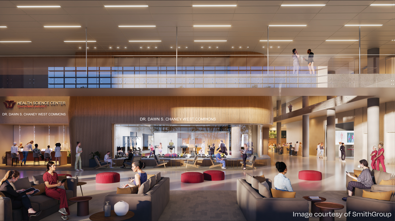
The Health Sciences Center is a new building, designed to support expanding programs in health and wellness, and functions both as an educational environment for students and a therapy gym open to the public. From the outset, the graphic strategy was intentionally different from Brackenridge. Rather than leading with narrative or brand expression, the approach here is conceived as an immersive, work-focused environment – where graphics support daily use and clarity without competing for attention.
Branding is expressed through nuanced, layered applications. The logo appears at times as texture and at others as abstraction, drawing inspiration from scientific references such as microscopes, cellular structures, and energy systems. The emphasis is on integration – graphics that feel embedded within the building rather than applied to it.
As the building takes shape, signage and environmental graphics reinforce orientation, mood, and continuity throughout the space. These elements complement the building’s forms and materials – guiding movement without calling attention to themselves. Color and pattern draw from interior finishes, subtly aligning with TWU’s brand palette. Together, the signage and graphics work in concert with the architecture to support flow, reflect materiality, and create a cohesive, intuitive experience.
Scale, Consistency, and Craft
Across both projects, the scope encompassed more than 670 signs, including wayfinding, identification, and large-scale environmental elements. While the campus contexts differ, the work was developed as a cohesive system – allowing individual moments to respond to their surroundings while maintaining consistency at a campus-wide level.
Delivering work at this scale required careful sequencing and coordination across disciplines. Design development, fabrication, and installation were aligned with construction schedules and phased openings, involving close collaboration with university stakeholders, architects, contractors, and installers. This approach allowed the signage and graphics to be integrated as the buildings came online, supporting key milestones without disrupting architectural intent.

A Campus That Feels Connected
Together, Brackenridge Hall and the Health Sciences Center reflect the breadth of Texas Woman’s University and the value of a long-term, collaborative approach. One space leads with story and welcome; the other supports focus, care, and daily use. Both demonstrate how environmental graphics can reinforce identity and experience through alignment with architecture – quietly, clearly, and with purpose.
Our Work in Education

Towson University
Towson’s Facilities Department began working with Takeform in 2019, drawn to our design+build approach to creating signage. Unlike previous experiences with multiple companies, Towson appreciated having a single partner that offered all the necessary expertise and capabilities under one roof.

American University
From lobbies to study lounges, American University transformed its campus experience through a cohesive signage and graphics strategy. By pairing clear wayfinding with layered, branded visuals, AU created spaces that are not only easier to navigate but also richer in personality and identity – bringing a sense of place to every corner of the campus.

Rochester Institute of Technology | SHED Building
Discover how Takeform created an on-brand, architecturally aligned signage system for RIT’s SHED, enhancing navigation and elevating the experience inside this innovative campus landmark.