The right treatment
Dual-purpose experiential graphics refine and redefine the patient journey
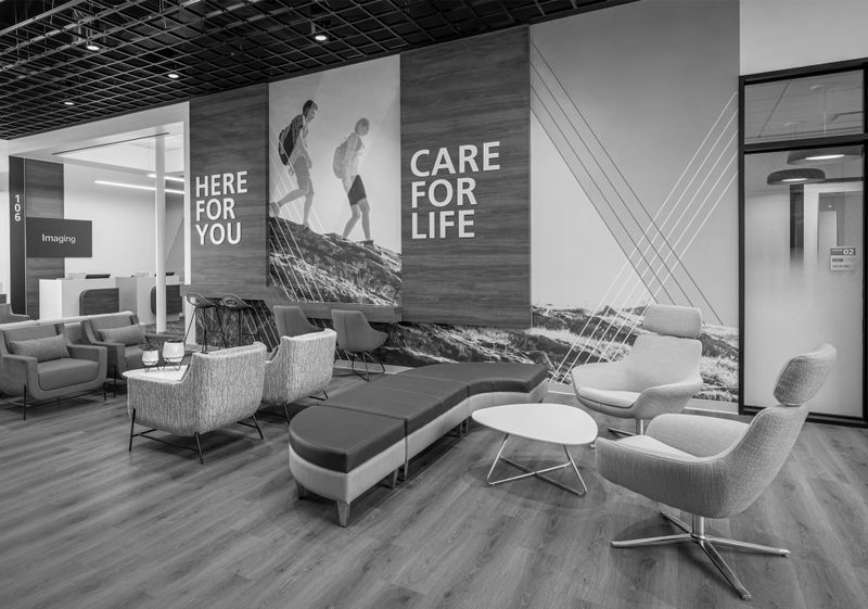
Everyone who comes to a healthcare facility is on a journey. Some are patients. Some are their loved ones. Every sign, every color, every visual cue shapes that journey – not only guiding their way, but also serving as intentional artwork that elevates the environment. Together, those visuals influence a person’s trust in the organization. When designed thoughtfully, experiential graphics blend functional wayfinding clarity with the emotional resonance of art – helping people find comfort and courage, even in the most stressful moments of their lives – directly supporting ever-improving patient and visitor experiences.
KEY CONTRIBUTOR:
Keri Fate
Director of Healthcare
An emotionally intelligent strategy
Wayfinding in hospitals used to mean a few generic signs. Of course, those days are long gone. Modern healthcare systems now see signage and experiential graphics as essential tools. They create warm first impressions, visually communicate brand values, and transform navigation into an integrated brand experience – strengthening brand perception while enhancing comfort and safety. These tools ensure patients and visitors feel cared for from the first step inside, while reinforcing consistent brand standards across multiple facilities. But their impact doesn’t stop at the first doorway.
The right graphics do more than help people get from point A to point B. They act as a silent, ever-present ambassador for the organization’s identity. They reduce anxiety, clarify complex spaces, support compliance requirements, and deliver an elevated brand experience that patients and visitors remember. All while reinforcing the values and visual identity of the organization. Today’s design strategy considers the psychological state of visitors. An expectant parent. A child in pediatrics. A senior navigating a new space. It’s a strategy that infuses both visual inspiration and clear direction to make every moment reassuring and comforting.

Designing for clarity and consistency
As healthcare campuses expand through new builds, renovations, and mergers, the risk of visual clutter and confusion grows. Inconsistent signs, outdated room numbers, and mismatched directories can quickly erode trust. Treating graphics as both wayfinding tools and art creates environments that feel intuitive and inspiring, while upholding brand standards across locations. The solution lies in system-wide consistency: clear visual guidelines, flexible sign systems, and easy-to-update graphics that speak with one voice. Still, consistency alone isn’t enough. To fully serve patients and visitors, hospitals you have to design with empathy, considering how people experience your space at every step.
True clarity comes from seeing the journey through a patient’s or visitor’s eyes. Elements like color-coded zones, biophilic graphics, tactile cues, and intuitive iconography all play a role in making wayfinding easier, even under stress. For staff, reliable, consistent signage frees up time and helps the whole system run more smoothly.
Creativity meets compliance
Great experiential graphics balance creativity with functionality. They are as much a brand and culture expression as they are a navigation tool. Murals, wall films, and tactile elements brighten the space, reflect the brand, and meet regulatory requirements. But they also address the unique needs of specialized environments, from calming, muted palettes in labor and delivery to bold, playful designs in pediatric units or anti-ligature signage solutions in behavioral health.

Brand colors can be carried through from exterior monuments to interior directories and room signage, helping visitors instantly know they’re in the right place – even when moving between campuses or care sites. This level of consistency reinforces brand value and builds trust across the patient’s journey. That trust is fragile, and clear wayfinding plays a vital role in protecting and strengthening it.
Thoughtful wayfinding protects your institution
Poor wayfinding results in missed appointments, delayed care, and unnecessary stress for patients and families. Confusing or outdated signs can erode trust and make any facility feel chaotic and unwelcoming. Patchwork fixes and uncoordinated updates often lead to operational headaches and rising costs.
By integrating artwork and wayfinding into a single experiential graphics strategy, healthcare organizations can simultaneously reduce stress, inspire confidence, and strengthen their brand perception. Clear, consistent cues help visitors move confidently through unfamiliar spaces. Carefully chosen colors and materials support comfort, lower anxiety, and encourage a sense of belonging. Each visual element – whether it’s a wall graphic or a directional sign – communicates that care is built into every aspect of the environment.
Healthcare environments are only growing more complex. So are the expectations of patients, families, and staff. That’s why forward-looking organizations are no longer treating signage as a basic utility. They’re investing in graphics that unify function and feeling.
Here are some key principles to keep in mind:
- Step into your space like a newcomer Take a walk around your hospital as if you’re visiting for the first time. Are directional signs easy to spot and understand at decision points like elevators or hallway intersections? In emotionally sensitive areas like pediatrics or behavioral health, do colors, finishes, and graphics help create a calm, reassuring atmosphere?
- Establish visual consistency everywhere Make sure signage for wayfinding uses a unified system so that visitors will easily understand how to get around, even from one department or building to the next. At the same time, ensure aesthetic elements like color, typography, and materials reflect the hospital’s brand and values, giving the space a cohesive and uplifting feel.
- Design for direction and emotion Use clear, easy-to-recall icons or color zones to guide patients and other visitors, especially during high-stress moments. Aesthetically, incorporate visual elements like nature imagery or soft colors that foster a sense of safety and comfort.
When designed thoughtfully, experiential graphics can create clarity, promote healing, reduce stress, and strengthen the brand at every step of the journey. By exploring your space with fresh eyes, building consistency across every sign, and designing with emotional awareness, you can make this part of your healthcare environment serve your patients more thoughtfully.


